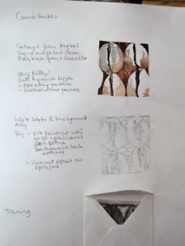
Here are some of my sketches exploring these things...

This one is of the knobbles only, on prepared sketch book paper.
It looks kind of interesting, but shows that there isn't enough context.

Collage on textured paper prepared by rubbing wax crayons against sisal rug.
The contrast was rather strong but it did get the 3D quality I was looking for.

This one was done with gouache, aiming to get the colours in the interesting colour palette from Georgio Armani A/W 2013. The mauve isn't quite lilac enugh, and the dark blue is just off too. The whole image doesn't really suit these colours!
I decided that I wanted to see if I could print a repeat pattern of these shapes, emphasising the white lumps around the entrances.
I used this photo tumblr_m7bldjN2x81ra81xco1_500.jpg
as a starting point...

 |
| Collage & tracings for printing |

This did emphasise the white lumps, but only by concentrating the printing paint around them. This wasn't really my intention, but I decided to go ahead and do the rest of the print to see what happened.
The image looked very like fruit with seeds in it - partly because of the more regular oval shape of the linocut. Something to consider if I go for this idea.

The grey patches were printed on using a compressed foam stamp cut according to the tracing.
The colour turned out quite a lot bluer than I expected. I used Paynes grey acrylic paint lightened with white.
The stamp was difficult to cut cleanly in detail.

This picture shows what happened when I used a different grey that I made up from combining indigo, velvet brown and white.
It does give more of an idea of the 'lips'.
Finally, I did another print using the same stamps but with more paint, to capture the regularity and linkedness in the original photo.

No comments:
Post a Comment