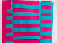
Exercise 1:
 |
It took some practice to get the two sheets to sit comfortably and squarely together.
Varying the size and shapes of the strips...
 |
| Narrow in one direction Wide in another |
 |
| Straight in one direction Getting narrower in the other |
 |
| Straight in one direction Spiral in the other |
 |
| Wavy lines in both directions. This makes interesting shapes at the intersections so I did the same with different colours... |
 |
| Undyed recycled paper and red linen showing the wavy shapes made by wavy lines in both directions. |
Using different materials........
 |
| I cut strips from the thin textured plastic of some overshoes that I was given for an exhibition at the Hayward Gallery. These are interwoven with plain white card. Not immediately inspiring! |
 |
| ...which had unexpectedly little effect. I cut out one area to see the effect and think it would be well worth exploring this more too, but I have run out of time for this exercise. |
I have been reading about Anne Sutton during this exercise. She seems to have worked within relatively narrow rules (as this exercise was), which allowed her to experiment with the few degrees of freedom she had with originality. I found that the restrictions of this exercise did that for me too, channelling my exploration into areas I may otherwise have passed over quickly unawares.
Ann Sutton 2003 by Diane Sheenan & Susan Tebby pub. The Crafts Council in association wth Lund Humphries. ISBN 0 85331 885
Ann Sutton 2003 by Diane Sheenan & Susan Tebby pub. The Crafts Council in association wth Lund Humphries. ISBN 0 85331 885


No comments:
Post a Comment