 |
| Making foam stamps and relief stamps for printing |
 |
| The 'seaweed' idea I was exploring in print during this stage |
I hadn't been able to find any high density foam so I tried making them from a baby sponge, stuck onto an off-cut of wood.
 |
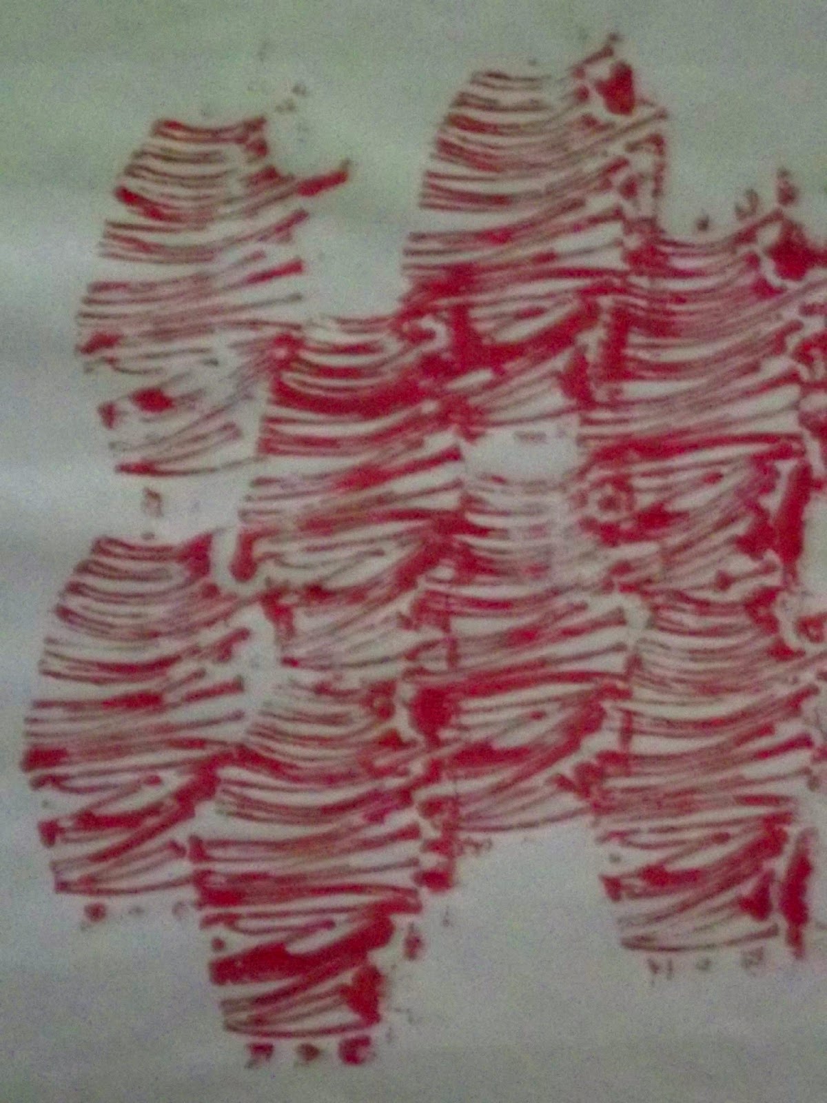
| Foam stamps, and superimposed string relief in the bottom right. |
The foam picked up too much paint in some places, and too little in others. This gave an interesting 3D curved look to them, and might be useful to produce something else in future, but that wasn't really what I was hoping for. And the fronds didn't separate out, or have any movement to them.
So I stuck some thin upholstery twine in curved lines to a piece of cardboard, using PVA. I let the string take it's natural curve rather than trying to impose a shape on it, to see what it would look like. I printed the fronds with that in a contrasting colour. There was much more detail, and much easier to print. The edges of the cardboard started getting printed too, so I cut them off. I decided that rather than persevere with the foam stamps I would try making a layer of these string fronds.

I liked this - there's something intriguing about the curved lines in different intensities of colour. Again it looks as if it is in relief - like mummy fingers or something wrapped up.
I did it again, but this time with the lines staggered so as to have no space between the shapes.
I like this one even more. It reminds me of worm casts and organ pipes but more organic and strong. It would make an interesting background for something I think, or perhaps something in its own right if I could put in some shadows or highlights in interesting colours. Or if I could bend it a bit, it could make the whole thing look curved and lumpy. Rather like those Geiger alien architectures.
I then tried out what this relief stamp would look like superimposed on itself in different directions. First in red, and then in two colours.


I think these are both potentially interesting things, the one in two colours especially.
While I was trying out printing on a variety of different kinds of paper, I saw that wrinkles or folds in the paper made discontinuities in the pattern which I thought might be worth exploring.


So I tried folding a piece of paper in various ways and then printing with this stamp on it. It doesn't look much but I like the idea of using folding in this way, and I think I will be trying more of this in future.
Japanese circles
When I was doing the pattern section of this course I copied a Japanese painting in my sketchbook, to try to learn what it was about the lines that made it so like a dance. And then I tried doing the same but with colour.
 |
| Charcoal copy of 'Woman Dancer with a Fan and Wand' from the Museum of Modern Art NY |
 |
| Using colour to make the movement |
I noticed that some of the movement was due to the swirly circles at the bottom of the skirts, so I tried using just the circles to make the movement.

and see what happened when I tried it.
I made a relief stamp with a
thicker kind of string
 |
| It was clearest on standard computer printing paper (yellow), and most blurred on white tissue (below) |
I used it on various different kinds of paper. I was surprised how the kind of paper didn't seem to make any difference to what this stamp looked like, even though it made a big difference to others eg the foam seaweed stamp, and the linocut.
 |
| Printed on pulp hand-made paper using pebeo fabric paints. The linocut doesn't show in this photo but in fact came out very well, showing all the detail, on this paper. |
The seaweed foam stamp has its 3D look on all these papers, accentuated by the fact that I hadn't washed the red paint off completely and some of it came out in speckles under the yellow for these prints.
I liked this effect and I think I will try to use it deliberately at some point.
By this time I was thinking I should try making a carpet of these circles to see where it led me.
 |
| Japanese circles, seaweed foam and seaweed relief printed on dark green linen with an irregular weave. Printed with acrylic paints. |
Something I learned from doing this was how much the surface you are printing on effects the result. (See how badly the seaweed foam stamp came out on the dark fabric above.) So it's always important to make a test print or two.
Iris
In my sketchbook recently I did a drawing of the iris of my eye, because it is intriguing visually, with lots of layers, glowing intensity, reflections and dark lines, as well as having a large number of potential meanings.
 |
| The iris of my eye, drawing in charcoal, pencil, oil pastel, and a stencil of the reflections. When I was drawing the charcoal and pencil one, I was struck by how many different layers there were, even in a black and white drawing like that. Making the stencil, I was surprised how sharp and geometrical the reflections were. |
 |
| I've put a big version of this because I love the way it glows. The colours are oil pastels in layers on black paper, and the lines are scratches made with the end of a paintbrush. |

I stencilled the reflections in pale blue pebeo texile paint onto more black paper. I got some advice about how to make the shapes sharp and stop the paint from getting under the edges of the stencil from 'Printing by Hand' by Lena Corwin, published by Stewart,Tabori & Chang 2008.
I'm not sure about the shape of the whole thing, but the reflections came out very well, making the flat paper look as if it's made of a lump of jellified oil. The paint should have had more green in it.
I then moved on to the black rays out from the centre, and decided that string relief would work. I wound string round a large and a smaller doughnut shape of cardboard and then used it to print some patterns. I used acrylic paint with textile medium for all the following.
 |
| This pattern gives some regular negative shapes. I thought the semicircles might build into something like a landscape but it was too regular for that. |
 |
| This was made on the matt side of brown envelope paper with two layers of the smaller relief stamp in different intensities of red. This looked better to me, almost like sea anemones or seeds down a microscope. I like the way one colour takes over from the other on different sides of the image. |
 |
| Printed on white poplin. I used various different colours of paint of similar intensity for all the small circles, but you can't tell that in this photo. The larger circles are centred around red circles printed using bubble wrap. The pattern on the left is pretty and fairly regular. The one on the right is more organic looking and spikey. I like the way the bubbles underneath make it look under water. I was pleased that the two circles overlap as intended at their intersection giving a darker circle like I have in my iris. |
 |
| Printed on almost transparent yellow organza. You can see a couple of pages of Vogue underneath keeping my printing pad clean. (This was taken before I realised that a hard surface is better for stencils!). This time I tried to print several layers together - both circles of 'rays' and also stencil the black parts of the iris on top. I used pinks for the black parts. Perhaps the pale pink inner circle didn't work so well. You can see the stencil card on the bottom right. |
 |
| This is the same iris with the reflection stencil added in yellow. I put white paper under the fabric, but sadly the background still hasn't come out as the lovely pale yellow it is in real life. You will have spotted that I accidentally reversed this image through not thinking it through properly when I made the relief stamps. The stencils are of course reversible. |
 |
| For this one I did the reflection stencil in complementary purple. I must have put it in the wrong place because one of the reflections is outside the ring of rays. Anyway it makes a lot more sense for the reflections to be light in colour, |
So far it seems to be a matter of being ridiculously ambitious and getting help from books and the internet when needed. I thought I would have to ask my tutor for lots of advice about the fundamentals, but so far that has not been necessary. I made a printing pad out of an old square tile, some blanket, and a thick plastic shopping bag. I have even found a supply of high density foam this week (Cowling & Wilcox Ltd, Camberwell).
I was initially worried that I didn't know what I was supposed to produce at the end of these exercises. But once I settled into it, it became obvious which drawings and ideas appealed to me, so I just got on with working with those, without worrying too much about what was going to come of it in the end. And obviously this has led to a whole lot of new ideas and techniques and combinations of things for my sketchbook.
And the other result of this is that yet again I wish I had a month or so to explore these things more, and see where they take me, but I don't, I have till the end of November to complete this section. Reminding me that this is the introductory course to build up a source book and a way of working to take with me into other courses.
No comments:
Post a Comment